Hai nửa / 2026
Bậc đá trong mưa
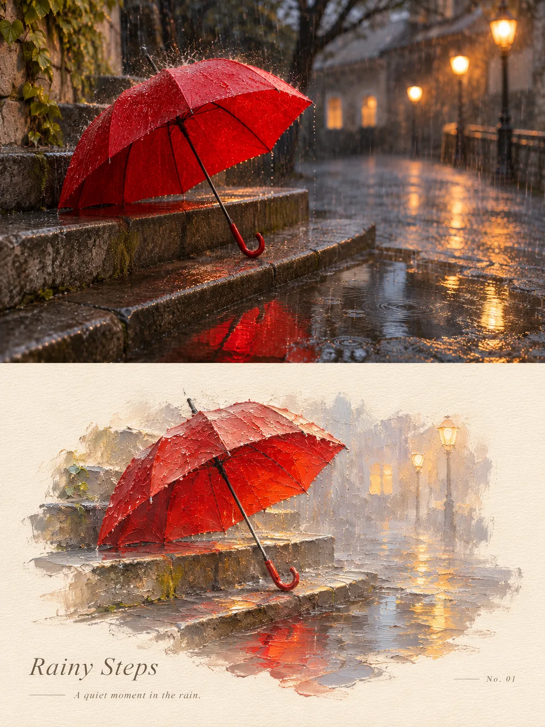
Một chiếc ô đỏ bỏ ngỏ trên bậc đá trong cơn mưa chiều. Nửa tranh vẽ giữ lại bậc đá, ngọn đèn và sắc đỏ trong vũng nước, rồi để các mép tan vào giấy.
Các mép nhòe đi như con phố sau một ô cửa kính mưa.
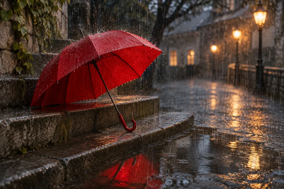
Prompt áp phích này cần một bức ảnh tải lên, nhưng ở đây không có bức ảnh nào. Bức ảnh phía trên được tạo trước, từ mô tả sau, rồi được trao cho prompt như thể có ai đó đã chụp nó:
3:2 landscape. An open red umbrella left on old grey stone steps in the rain at dusk, raindrops bouncing on its canopy, its red reflected in a puddle, warm lamplight blurred in the background, fine rain visible in the air. 35mm lens, slightly above eye level. A real photograph, not an illustration. No people, no text, no logos, no watermark.
Rainy Steps và A quiet moment in the rain là lời của chính tấm áp phích. Prompt áp phích ở đây được đăng bằng bản dịch tiếng Anh.
Impasto oil-painting miniature comparison poster Goal Turn each input photo into its own poster comparing photography and design; never combine photos. It works for people, animals, plants, architecture, objects and any kind of scene: follow what the original photo expresses, not a fixed theme. Format and layout A 3:4 portrait canvas, split strictly in half, top and bottom, 50% each. The top is the photography zone, the bottom the design zone; the two meet directly along a clean horizontal edge, with no gap, gradient, feathering or overlap. All design elements and text sit inside the bottom zone; add no extra title area. Photography zone Keep the original photo's real photographic texture, the subject's identity and number, outline, pose, proportions, key details, perspective, position, natural light and shadow and original colours, with only a light, refined colour grade. Secondary surroundings may be cropped or the background slightly extended, but never crop out, stretch, distort, mirror, duplicate, move or redraw the subject. No text, borders, paper texture or decoration in the photography zone. Design zone Take the subject, outline, pose and spatial relationships from the same photo and rebuild them as an impasto oil-painting miniature with a sculptural sense of volume, through layered paint, palette-knife texture, hand shaping and undulating edges, rather than a mechanical copy of the photo's detail. Place the subject in the centre or slightly off it, and keep large areas of warm white paper blank; support the subject with a band of colour taken from the original photo, which may become ground, water, a path or an abstract slice of space. A few reflections, glints of light, rain or mist, or trailing strokes may stay, but add nothing unrelated. Colour and material Draw the main colour, the secondary colours and the warm–cool relationships from the original photo, and reduce them to a harmonious, limited palette, keeping the subject's own colour character first rather than a fixed scheme. Raise the brightness and translucency of the design zone a little. Use the thickest paint for the colour band, the slices of setting and the highlights, and keep the subject finely structured; the paper shows a fine texture and a matte finish, never a plastic look. Text In the blank space of the design zone, place a short English title with one line of small subtitle; if needed, add a very small number or a tiny note. The type is thin and restrained, and may follow the subject's axis or the edge of the blank space. The text must come from what can be confirmed about the subject or the mood, spelled correctly; without reliable information, add no place names, dates, coordinates, brands, signatures, accounts or placeholders. Mood Quiet, restrained and refined, with the order and collectable feel of an art publication; build the layers through material, blank space, volume and the subject's relationships. Avoid Combining different photos, changing the subject, unrelated top and bottom scenes, an illustrated photography zone, cluttered decoration, extra title bars, garbled or repeated text, logos, signatures, watermarks, cartoon styles, saturated clashing colours, dull muddy colours, fluorescent colours, candy filters, glossy plastic 3D, cheap CG and crowded scenes.