パレットナイフの街 / 2026
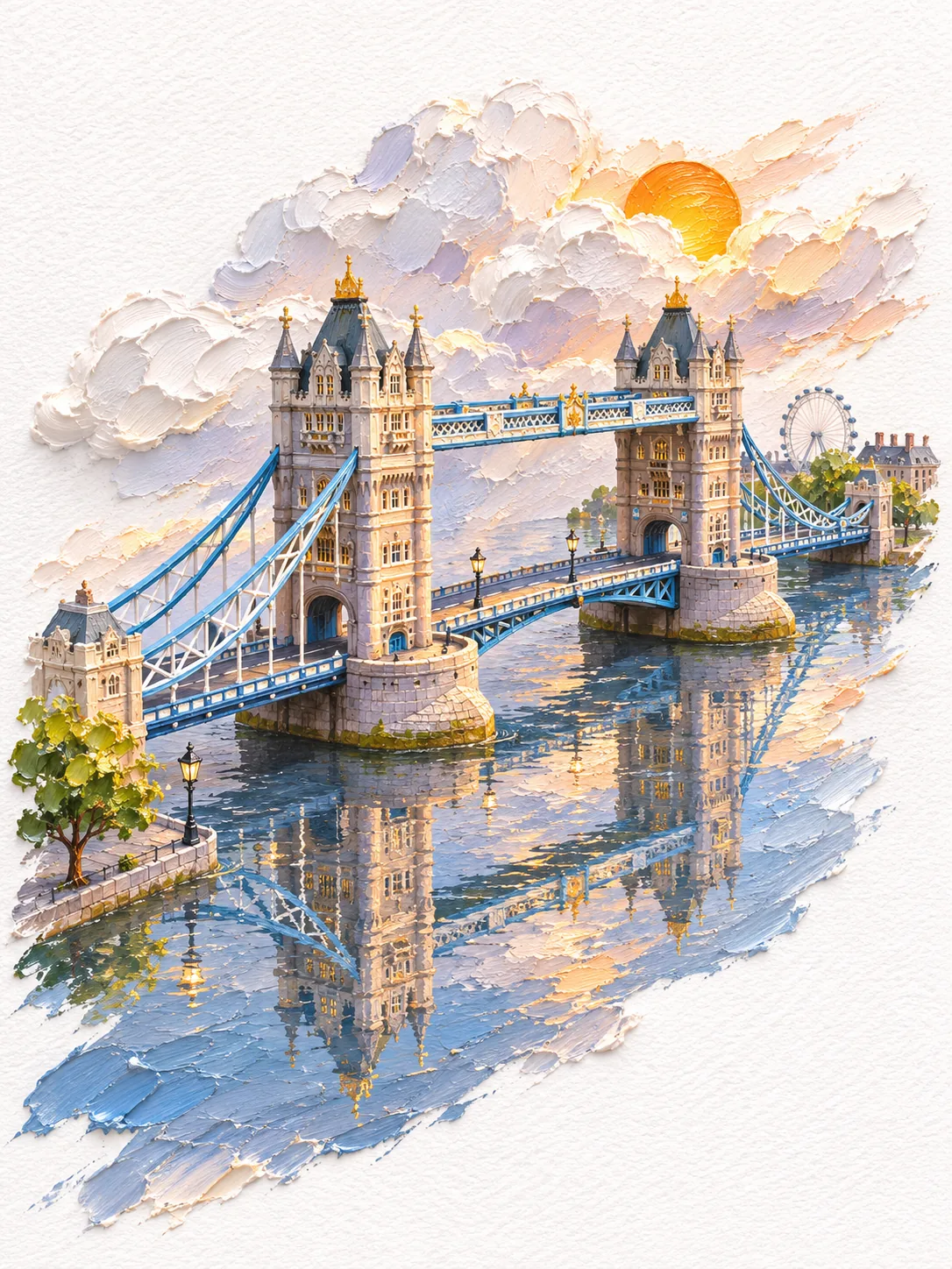
タワーブリッジと、借りてきた観覧車
ナイフで塗り重ねたロンドンのタワーブリッジ。テムズ川に青と石の色。すぐ後ろには、数キロ上流から引き寄せられたロンドン・アイ。
タワーブリッジの色は、人々が思い描くロンドンの色から来ている。プロンプトが許すとおりだ。淡い石、鉄骨の青、尖塔のわずかな金、ふだんのテムズ川より青い川。
プロンプトは名所のまわりにわずかな景物を添えることも許していて、モデルが選んだのはロンドン・アイだった。数キロ上流から引き寄せられ、橋のすぐ後ろに立っている。同じ眺めではないけれど、同じ絵はがきには入っている。
このプロンプトはひな形で、街ごとに変わるのは角かっこの中の名前だけ。ここでは英訳を載せている。
[London · Tower Bridge], oil painting style, a 3D miniature landscape in thick palette-knife impasto, with paint of varying thickness giving a real sense of volume. 3:4 portrait, a centred diagonal composition. The main colour comes from the landmark's own signature colours, or from the colours people associate with the city. A sweep of oil paint in matching tones runs from the lower left to the upper right, carrying the finely made landmark and rendering its iconic outline, structure and materials accurately, with a few related elements dotted around it. The paint at the bottom and the water in front echo the building's main colour; the water clearly reflects the whole landmark, keeping natural glints and layers of colour. Behind the building, milky-white clouds are built up from thick oil paint, varied in size and overlapping front to back, with clearly raised thickness, palette-knife texture and soft cast shadows, and an orange-gold sun rises between them. About a 45-degree oblique view from above, soft side light, a minimal layout, large areas of white textured paper left blank, the edges of the paint showing natural scraped and broken strokes. No text, no watermark.